Eye catching, without being obnoxious.
Name badge design is something that should grab the attention of others. This badge should show off your event name as well as any sponsors, and obviously the attendee’s information. So what exactly to do? Lots of information to cram on? How do you make your name badge look professional, and not too busy?
Determine the most pertinent information.
What is the most pertinent information for the badge? Define your must have’s vs nice to have’s for your event badge.
- Attendee name
- Your event logo and name
- Attendee company
- Any sponsor information
- Agenda.

Next, highlight the MOST important information, and design away.
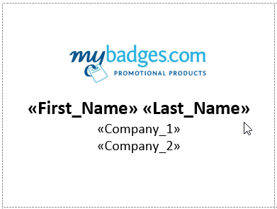
On the list you just had, mark what is most important, so you can start deciding on how you are going to lay out your name badge. Once you’ve ranked your most important information, start to design your badge. Make sure you have a clear and easy to read font for the text on the name badge as there is nothing more frustrating that being unable to read someone’s name when trying to interact.
Setup your mail merge.
Once you’re happy with how you’ve laid out your event name badges, get started on your mail merge and print yourself, or send the PDF through to your printer et voila! Badges, done! Want a detailed walkthrough? Check out our mail merge blog post.


